Fatherly
Role
Lead Designer
Scope
Brand Redesign
Web design
Art Direction
Editorial design
The Challenge
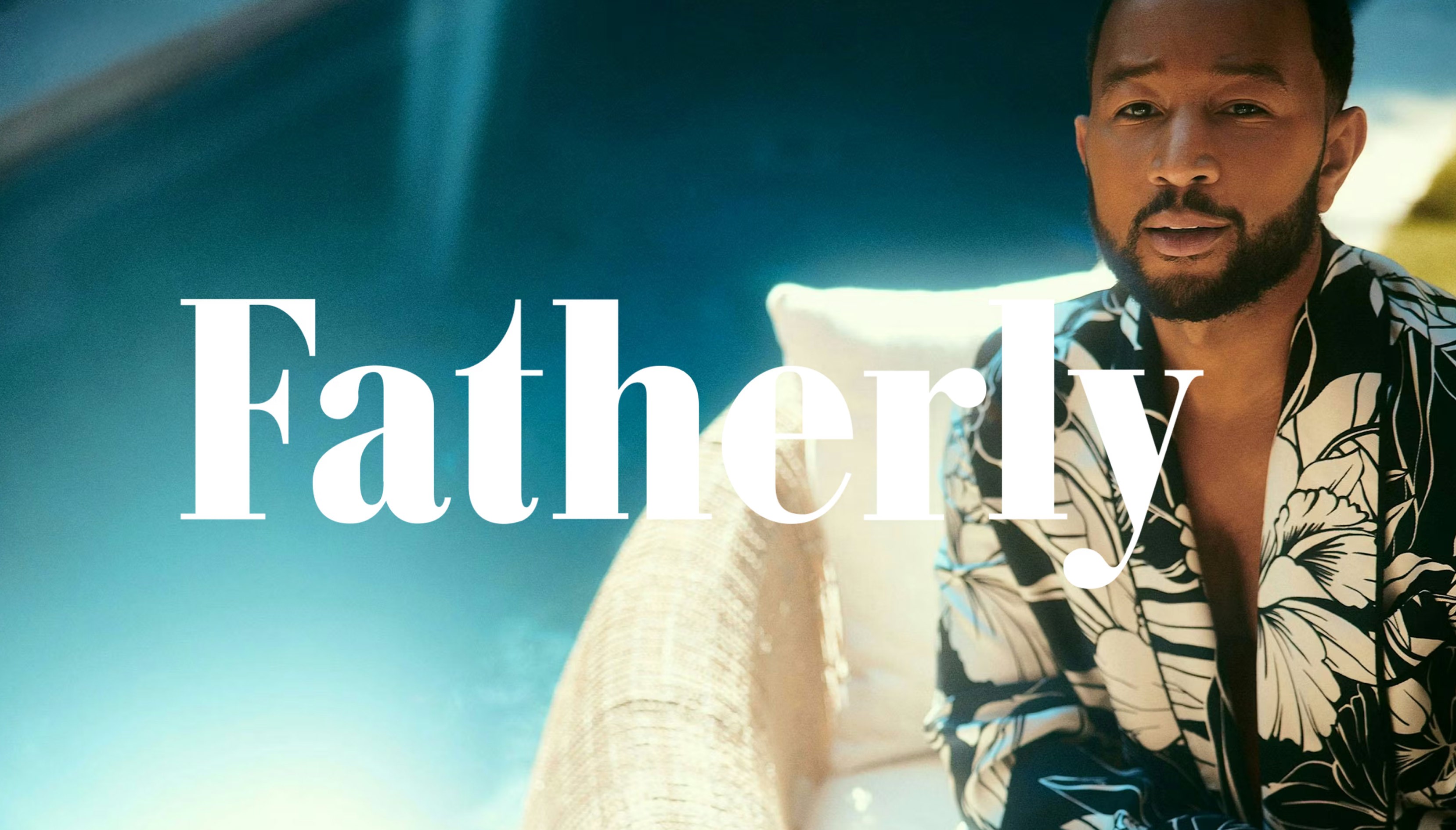
Rebrand a leading digital media brand for modern parents. Fatherly had built a real audience and a real identity since launching in 2015. It just needed to grow up. The editorial was strong. The visual system wasn't keeping pace.
Fatherly was acquired by BDG in 2021. The rebrand supported growth to new audience heights. Growth the editor-in-chief attributed to stronger editorial focus, SEO, social strategy, and a brand that finally looked the part. The expanded system supported numerous extensions beyond the core site.
Rebuilding the house while everyone's still living in it
Fatherly
Role
Lead Designer
Scope
Brand Redesign
Web design
Art Direction
Editorial design
The Challenge
Rebrand a leading digital media brand for modern parents. Fatherly had built a real audience and a real identity since launching in 2015. It just needed to grow up. The editorial was strong. The visual system wasn't keeping pace.
Fatherly was acquired by BDG in 2021. The rebrand supported growth to new audience heights. Growth the editor-in-chief attributed to stronger editorial focus, SEO, social strategy, and a brand that finally looked the part. The expanded system supported numerous extensions beyond the core site.
Rebuilding the house while everyone's still living in it
Fatherly
Role
Lead Designer
Scope
Brand Redesign
Web design
Art Direction
Editorial design
The Challenge
Rebrand a leading digital media brand for modern parents. Fatherly had built a real audience and a real identity since launching in 2015. It just needed to grow up. The editorial was strong. The visual system wasn't keeping pace.
Fatherly was acquired by BDG in 2021. The rebrand supported growth to new audience heights. Growth the editor-in-chief attributed to stronger editorial focus, SEO, social strategy, and a brand that finally looked the part. The expanded system supported numerous extensions beyond the core site.
Rebuilding the house while everyone's still living in it
Fatherly
Role
Lead Designer
Scope
Brand Redesign
Web design
Art Direction
Editorial design
The Challenge
Rebrand a leading digital media brand for modern parents. Fatherly had built a real audience and a real identity since launching in 2015. It just needed to grow up. The editorial was strong. The visual system wasn't keeping pace.
Fatherly was acquired by BDG in 2021. The rebrand supported growth to new audience heights. Growth the editor-in-chief attributed to stronger editorial focus, SEO, social strategy, and a brand that finally looked the part. The expanded system supported numerous extensions beyond the core site.
Rebuilding the house while everyone's still living in it
The Brand: Typography, Color, Identity
The existing Fatherly logo had energy. We weren't throwing it out. We were refining it. Making it more intentional. Building a system around it that could actually scale.
Typography became the backbone of the new system. We landed on a three-level hierarchy: Frank Ruhl Libre Black for the primary headline, a typeface with real editorial weight. GT America Compressed Black and GT America Condensed Bold handled the secondary headline work and eyebrow labels, giving us range from bold feature moments to the more utility-driven UI copy.
The Brand: Typography, Color, Identity
The existing Fatherly logo had energy. We weren't throwing it out. We were refining it. Making it more intentional. Building a system around it that could actually scale.
Typography became the backbone of the new system. We landed on a three-level hierarchy: Frank Ruhl Libre Black for the primary headline, a typeface with real editorial weight. GT America Compressed Black and GT America Condensed Bold handled the secondary headline work and eyebrow labels, giving us range from bold feature moments to the more utility-driven UI copy.
The Brand: Typography, Color, Identity
The existing Fatherly logo had energy. We weren't throwing it out. We were refining it. Making it more intentional. Building a system around it that could actually scale.
Typography became the backbone of the new system. We landed on a three-level hierarchy: Frank Ruhl Libre Black for the primary headline, a typeface with real editorial weight. GT America Compressed Black and GT America Condensed Bold handled the secondary headline work and eyebrow labels, giving us range from bold feature moments to the more utility-driven UI copy.
The Brand: Typography, Color, Identity
The existing Fatherly logo had energy. We weren't throwing it out. We were refining it. Making it more intentional. Building a system around it that could actually scale.
Typography became the backbone of the new system. We landed on a three-level hierarchy: Frank Ruhl Libre Black for the primary headline, a typeface with real editorial weight. GT America Compressed Black and GT America Condensed Bold handled the secondary headline work and eyebrow labels, giving us range from bold feature moments to the more utility-driven UI copy.


The existing Fatherly logo had energy. We weren't throwing it out. We were refining it. Making it more intentional. Building a system around it that was more flexible.
The existing Fatherly logo had energy. We weren't throwing it out. We were refining it. Making it more intentional. Building a system around it that was more flexible.
The existing Fatherly logo had energy. We weren't throwing it out. We were refining it. Making it more intentional. Building a system around it that was more flexible.
The existing Fatherly logo had energy. We weren't throwing it out. We were refining it. Making it more intentional. Building a system around it that was more flexible.
Photography: From Illustration-First to Image-Led
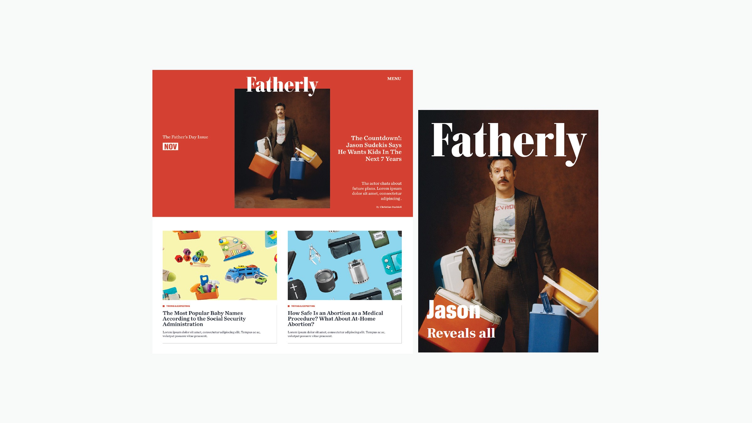
Fatherly had built its visual identity largely around illustration. It worked. It gave the brand a consistent look and a lot of creative flexibility. But as the brand grew, illustration alone wasn't carrying the weight. It was starting to feel like a workaround rather than a choice.
The first thing we tackled was defining what Fatherly photography actually looked like. Not stock. Not aspirational in a way that felt out of reach. Real, imperfect, humorous, spontaneous. Dads who look like dads.
For cover shoots, we developed two distinct approaches: studio and location. Studio gave us control and the ability to push conceptually. Location gave us warmth and context. Both had to feel like Fatherly, never like they wandered in from a different publication.
Photography: From Illustration-First to Image-Led
Fatherly had built its visual identity largely around illustration. It worked. It gave the brand a consistent look and a lot of creative flexibility. But as the brand grew, illustration alone wasn't carrying the weight. It was starting to feel like a workaround rather than a choice.
The first thing we tackled was defining what Fatherly photography actually looked like. Not stock. Not aspirational in a way that felt out of reach. Real, imperfect, humorous, spontaneous. Dads who look like dads.
For cover shoots, we developed two distinct approaches: studio and location. Studio gave us control and the ability to push conceptually. Location gave us warmth and context. Both had to feel like Fatherly, never like they wandered in from a different publication.
Photography: From Illustration-First to Image-Led
Fatherly had built its visual identity largely around illustration. It worked. It gave the brand a consistent look and a lot of creative flexibility. But as the brand grew, illustration alone wasn't carrying the weight. It was starting to feel like a workaround rather than a choice.
The first thing we tackled was defining what Fatherly photography actually looked like. Not stock. Not aspirational in a way that felt out of reach. Real, imperfect, humorous, spontaneous. Dads who look like dads.
For cover shoots, we developed two distinct approaches: studio and location. Studio gave us control and the ability to push conceptually. Location gave us warmth and context. Both had to feel like Fatherly, never like they wandered in from a different publication.


Web Design: Making the Editorial Work Harder
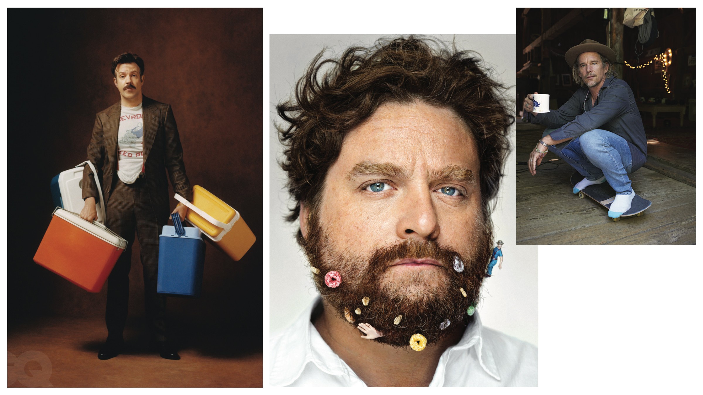
The site redesign was about one thing: the content deserved better. Fatherly publishes genuinely good journalism (health, science, parenting, relationships) and the layout wasn't surfacing it the way it should.
We rebuilt the homepage with a clearer hierarchy. Strong featured moments for cover stories. Organized sections for editorial verticals. A design system flexible enough to handle the range of content types, from quick gear roundups to long-form features, without everything looking the same.
Web Design: Making the Editorial Work Harder
The site redesign was about one thing: the content deserved better. Fatherly publishes genuinely good journalism (health, science, parenting, relationships) and the layout wasn't surfacing it the way it should.
We rebuilt the homepage with a clearer hierarchy. Strong featured moments for cover stories. Organized sections for editorial verticals. A design system flexible enough to handle the range of content types, from quick gear roundups to long-form features, without everything looking the same.
Web Design: Making the Editorial Work Harder
The site redesign was about one thing: the content deserved better. Fatherly publishes genuinely good journalism (health, science, parenting, relationships) and the layout wasn't surfacing it the way it should.
We rebuilt the homepage with a clearer hierarchy. Strong featured moments for cover stories. Organized sections for editorial verticals. A design system flexible enough to handle the range of content types, from quick gear roundups to long-form features, without everything looking the same.

Headline card variants gave editors real options without creating chaos. Each version had a purpose: some led with photography, some leaned on typography and color blocks, some were built for sponsored content. The system had rules, but it wasn't rigid.
Headline card variants gave editors real options without creating chaos. Each version had a purpose: some led with photography, some leaned on typography and color blocks, some were built for sponsored content. The system had rules, but it wasn't rigid.
Headline card variants gave editors real options without creating chaos. Each version had a purpose: some led with photography, some leaned on typography and color blocks, some were built for sponsored content. The system had rules, but it wasn't rigid.

Fatherly publishes genuinely good journalism and the layout wasn't surfacing it the way it should.
Fatherly publishes genuinely good journalism and the layout wasn't surfacing it the way it should.
Fatherly publishes genuinely good journalism and the layout wasn't surfacing it the way it should.
Illustration: Creating Systems Around What Worked
We kept illustration. We just gave it more structure.
The existing approach was loose. What we built was a defined taxonomy of styles, each with a specific editorial purpose: Photo Surrealism for conceptual, mind-bending story art. Surreal Scale for collage-driven pieces where the juxtaposition is the idea. Layered Photography for celebrity features, creating a dynamic, multi-exposure effect. Graphic Minimalism for cleaner, more restrained pieces where the image serves the text.
Illustration: Creating Systems Around What Worked
We kept illustration. We just gave it more structure.
The existing approach was loose. What we built was a defined taxonomy of styles, each with a specific editorial purpose: Photo Surrealism for conceptual, mind-bending story art. Surreal Scale for collage-driven pieces where the juxtaposition is the idea. Layered Photography for celebrity features, creating a dynamic, multi-exposure effect. Graphic Minimalism for cleaner, more restrained pieces where the image serves the text.
Illustration: Creating Systems Around What Worked
We kept illustration. We just gave it more structure.
The existing approach was loose. What we built was a defined taxonomy of styles, each with a specific editorial purpose: Photo Surrealism for conceptual, mind-bending story art. Surreal Scale for collage-driven pieces where the juxtaposition is the idea. Layered Photography for celebrity features, creating a dynamic, multi-exposure effect. Graphic Minimalism for cleaner, more restrained pieces where the image serves the text.


Applied across the site (feature stories, gear sections, celebrity profiles, fitness content) the system gave editors and art directors a shared language.
Applied across the site (feature stories, gear sections, celebrity profiles, fitness content) the system gave editors and art directors a shared language.
Applied across the site (feature stories, gear sections, celebrity profiles, fitness content) the system gave editors and art directors a shared language.


Results
The rebrand helped take Fatherly to new audience heights under BDG. The editor-in-chief attributed the growth to a combination of stronger editorial focus, SEO, social strategy, and a brand that finally looked the part. The expanded brand system supported numerous extensions beyond the core site.
The work also proved something that matters to me on any rebrand: you can honor what came before while still pushing it significantly forward. The original team built something great. Our job was to take it further, and eventually, they could see that too.
That last part might be the result I'm most proud of.
Results
The rebrand helped take Fatherly to new audience heights under BDG. The editor-in-chief attributed the growth to a combination of stronger editorial focus, SEO, social strategy, and a brand that finally looked the part. The expanded brand system supported numerous extensions beyond the core site.
The work also proved something that matters to me on any rebrand: you can honor what came before while still pushing it significantly forward. The original team built something great. Our job was to take it further, and eventually, they could see that too.
That last part might be the result I'm most proud of.
Results
The rebrand helped take Fatherly to new audience heights under BDG. The editor-in-chief attributed the growth to a combination of stronger editorial focus, SEO, social strategy, and a brand that finally looked the part. The expanded brand system supported numerous extensions beyond the core site.
The work also proved something that matters to me on any rebrand: you can honor what came before while still pushing it significantly forward. The original team built something great. Our job was to take it further, and eventually, they could see that too.
That last part might be the result I'm most proud of.