Branding New York without the clichés

Build a visual identity for a 13-episode series about actually living in New York… not the obvious tourist stuff. Real tips. The kind of knowledge you only get from actually living there. The show needed to feel like the city: confident, layered, iconic, but not a souvenir shop cliché.
I owned the project as solo designer: brand strategy, logo, visual identity, social assets, and art direction that informed the physical set design.
The NYC Field Guide Won 5 Emmy Awards (Best Business Content, Best Host, Best Lighting, Best Editor, Best Promo). Visual system worked seamlessly across broadcast, social, and physical production.
The idea
I grew up in New York. Let's start there.
The city doesn't have a single personality. That's the whole point. It's loud and quiet. Gritty and gorgeous. Historic and always reinventing itself in ways that still surprise me.
When you're building a brand for something called the NYC Field Guide, the temptation is to lean into the obvious: subway maps, yellow cabs, the Statue of Liberty, a pigeon or two. Been there, seen the T-shirt, never bought it.
The identity needed to feel like New York without being nostalgic or referential. Grand. Iconic. Immediate.

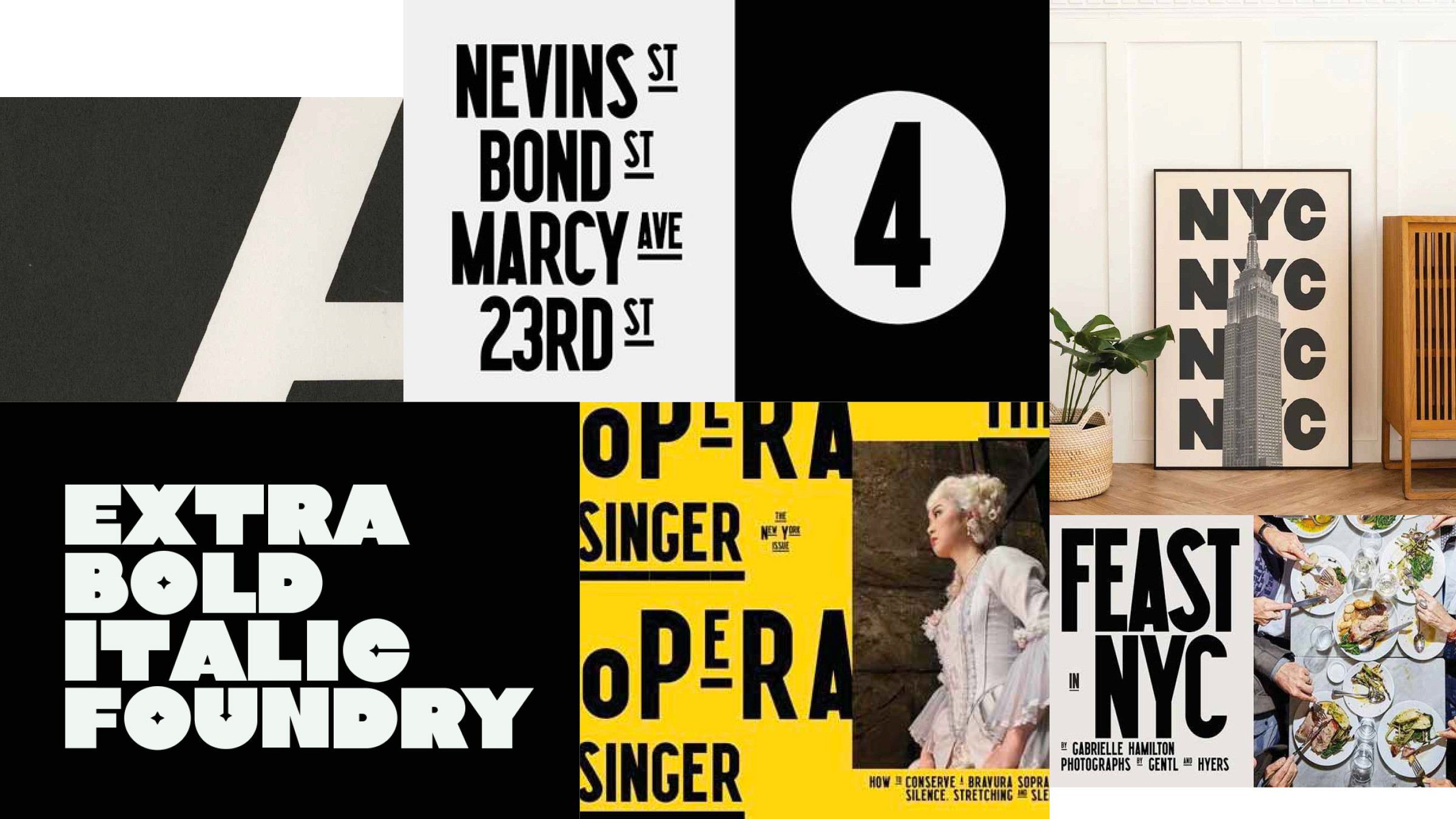

The System
The logo uses the skyline as inspiration. Capturing the grandeur of NYC's architecture without being literal. Bold, confident, instantly recognizable.
The color palette resists the obvious (I was tempted by the subway system, I won't lie). Instead, it pulls from the cultural richness of the city itself: warm, vibrant, photographable (that's a word).
The typography does heavy lifting. Bold when it needs to be, flexible enough to work across broadcast, social, and physical production.


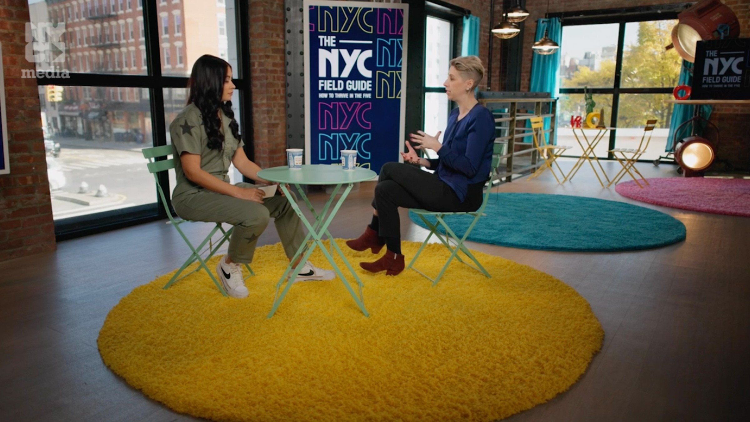
From Screen to Set
The visual identity extended beyond the screen. The typography, color system, and graphic attitude fed directly into the physical set design through screens, pillars, environmental graphics.
That kind of continuity doesn't always happen. When it does, it means the work actually worked. The brand became the world the show lives in, not just a logo on a lower third.

That kind of continuity doesn't always happen. When it does, it means the work actually worked. The brand became the world the show lives in, not just a logo on a lower third.
The Outcome
The NYC Field Guide launched successfully across its 13-episode run. The brand held together across broadcast, social, and physical production. The visual identity gave the show a distinct presence in a crowded media landscape.
And then it won five Emmys: Best Lighting, Best Business Content, Best Editor, Best Promo, and Best Host/Moderator.
I found out on LinkedIn.
I think about that more than I probably should. Building something solo, a direction deck, some logo concepts, a color palette, and watching it win five awards? That's the whole job.
New York is a hard city to capture. I think we got close.
